|

|

Introduction to Menu Navigation
The Menu Navigation component is used to create dynamic navigational menus for your SharePoint sites. You can create navigational menus for a specific site, or you can create a global menu that can be used across all your SharePoint sites, providing your users with a simple, intuitive method to move through the workplace. If an end user does not have access to a menu item, that item will not be displayed.
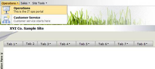
The Menu Navigation can be shown with or without submenus and descriptive text, in two different styles. The excerpt from a sample page below shows the Menu Navigation with the two styles that can be applied.
SharePoint
Style CorasWorks
Style
![]()
![]()

![]()

There can be multiple instances of the Menu Navigation components on a single page, each with a different configuration and a different look. In addition, like all of the other CorasWorks Basic navigation components, the Menu Navigation supports SharePoint themes. When you change the theme applied to a page, the appearance of the Menu Navigation can change to blend with that theme.
The Menu Navigation offers several end user-friendly features, as well. For example, when there are one or more submenu options available from a higher level menu option, a small triangle is displayed to the right of the higher level menu option. In the example above, there are no submenu options available from Tab 2, but there are submenus on the other tabs. In addition, the user has the option to use either the mouse or the keyboard arrow keys to navigate between menu items.
|
TIP |
One of the most powerful uses of the Menu Navigation is to create a global menu for your workplace. You can use this component at the top of each page of your site templates and point all of them to a single central view. Change the menu options in that central view, and all of the menus will automatically and immediately update throughout the system. |