|
If you chose Dynamic configuration above, a section with the following properties is shown at the bottom of the page.
•Calculation column – The column that contains the data that will be shown in the chart, typically on the Y axis unless you are working with a pie or doughnut chart. The calculation selected below will be performed against the values or items in this column.
•Data calculation – The calculation to perform against the data in the column selected above. If the selected column contains non-numeric data, the only available calculation is Count. Otherwise, the options include:
o Average
o Maximum
o Minimum
o Standard Deviation
o Variance
•Category column – The column that contains the categories that are applied to the items, typically shown on the X axis unless you are working with a pie or donut chart. Another way to look at this is each unique value in the category column is shown as a bar or slice on the chart. This can be the same column that is identified as the calculation column.
•Series column – The column that contains the values to be used as the data series, representing a series of unique data in the data source that appear in each category. On 3D charts, this is represented as the Z axis. This property is not shown on the wizard page when the Chart Type is set to Pie or Doughnut.
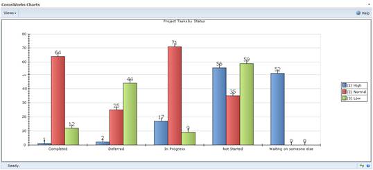
It may be easiest to understand the function of each property in the context of an example. For our example, we will look at some Tasks lists and create a column chart that shows the number of tasks with each status. Within each status, we want to see how many items are assigned the various priority values.
To achieve this:
1. We want to show the number of items there are in each status, so we set the Calculation column to Title. For our example, it doesn’t matter what column we choose here because we are simply going to count the items. If we wanted to perform another type of calculation, we would have to choose a numeric column.
2. The Data calculation is set to Count because all we want to do is count the items.
3. The Category column is set to Status because we want to show the number of items within each status. If we set the Chart Type to Column, the statuses (categories) will be displayed along the bottom of the graph, on the X axis.
4. The Series column is set to Priority. We are creating a Clustered Column chart, so within each set of bars that represents a status there will be a bar for each priority value.
A sample Clustered Column chart that includes these property settings is shown below.
The number of items is
shown here, using the Count
calculation![]()
![]()
![]()
| ||||
| ||||