Step 1: View Properties Page – Define Navigation Options For Menu Designer

Choosing Menu Display Style

Selection page is used to select a model list that will be used to identify the columns to be referenced by the view.

9.  Located under the Configuration -> View Properties page, the Menu display style offers a pair of display options:

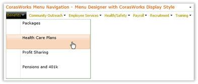
      CorasWorks: Default selection.  Displays information in tab format, with drop-down menus.  The tabbed format is a good option for navigating through a site.
Title: Menu Display In CorasWorks Style - Description: Menu Display In CorasWorks Style

      SharePoint: Displays information in a format similar to SharePoint’s drop-down menus.  Reflects the site’s theme in its coloring.  In the example image below, SharePoint 2010’s Yoshi theme is used.Title: Menu Display In SharePoint Style - Description: Menu Display In SharePoint Style
 
This is a good option for “global” navigation as it shows its options in a drop-down style.

Additional Options

10.  The Show breadcrumb trail option is disabled by default.  It is used to indicate if a breadcrumb trail should be displayed near the top of the page. Each item in the breadcrumb trail is hyperlinked for easy navigation.
11.  The Menu Navigation is to be used with a panel template option is deprecated and included for backward compatibility.  By default, this option is unchecked.  If the page is panel-enabled (as with some of the starter templates) and this option is selected, when the user selects a Menu Navigation item, only the panel portion of the page (the content area) will be refreshed. The outer portion (frame) will not be affected.
12.  The Show menu items on click is unchecked by default.  When checked, the menu navigation will display the next level of menu items only when the user clicks on an item. Leave the checkbox blank to show the next level of menu items when the user hovers over an item.

13.  The Max characters before word wrap option is empty by default.  This field controls the number of characters displayed in the tab/menu before wrapping.  The Menu Navigation will not truncate or wrap a word.  Instead, the breaks are introduced after a word.  This can result in unusual formatting results when longer words are used.

14.  The List view to reference option is used with the Menu Navigation List and Cascade Navigation List Views only.  Its default value is Main and it is used to determine the top level of the menu items to include in the Menu Navigation display.

15.  Once all necessary changes have been made, click on the Apply icon (Title: Apply Icon - Description: Apply Icon) to save the settings.

16.  To make additional changes to the view, click on the appropriate item in the navigation zone along the left side of the page.  Otherwise, click on the on the Home icon (Title: Home Icon - Description: Home Icon) found at the top of the page to return to the home page of the Display Wizard.