The context menu is the menu that is displayed when the user clicks with a secondary mouse button anywhere within a grid. It provides quick access to some of the most commonly requested grid functions. The context menu provides different options depending on whether you click on a row in a grid or on the column headings.
The builder has the option to enable or disable certain options, and some context menu options are SharePoint standards. The tables below describe what can be done with each context menu option.
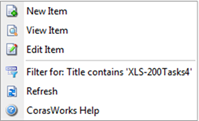
When the user access the context menu via a row in a grid, the menu looks like this and the options work as described below:

Create a new item in the same list as the item that was clicked on to access the context menu. An entry form is displayed with all fields that can be populated. The end user can add a document to a document library via this option.
Open an action form and view all available information regarding the selected item.
Open an action form and make any necessary changes. Click OK when you are finished to save the changes and return to the display.
Apply a filter to show only the items that contain the value in the selected column. (The column that the mouse is “over” when the context menu is accessed.) This can include column values that contain the special characters ' and ".
Select an action to execute against the currently selected item.
Refresh the contents of the grid, so any changes or additions are reflected
Access the CorasWorks online help for Grid Displays.
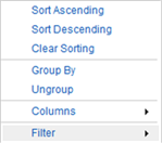
When the user access the context menu via a column heading, the menu looks like this and the options work as described below:

Sort the contents of the grid in ascending (alphabetical) order, based on the contents in the currently selected column.
Sort the contents of the grid in descending order, based on the contents in the currently selected column.
Removes the sorting on the selected column.
Group the contents of the grid based upon the contents of the currently selected column.
Removes the grouping for the selected column.
The Filter menu allows for the entry of up to two search variables on the column. Enter the variables, choose the filter type (i.e. – Equals, Contains, Less Than), and click on the Filter button to apply. There is also a Clear Filter button.