This XML property is used to define the features and functions of the grid. It can contain the elements listed below. Most are Boolean values, so they can be set to true/false to be turned on/off.
Example:
<gc>
<c>
<AutoGenerateColumns>false</AutoGenerateColumns>
<AllowPaging>true</AllowPaging>
<AllowSorting>true</AllowSorting>
<AllowFilteringByColumn>false</AllowFilteringByColumn>
<AllowMultiRowSelection>true</AllowMultiRowSelection>
<AllowKeyboardNavigation>true</AllowKeyboardNavigation>
<AllowRowSelect>true</AllowRowSelect>
<ShowFooter>true</ShowFooter>
<ShowStatusBar>true</ShowStatusBar>
<Skin>Web20</Skin>
<AllowColumnResize>true</AllowColumnResize>
<AllowColumnsReorder>true</AllowColumnsReorder>
<AllowResizeToFit>true</AllowResizeToFit>
<AllowRowResize>true</AllowRowResize>
<EnableHeaderContextMenu>true</EnableHeaderContextMenu>
<EnableHeaderContextFilterMenu>true</EnableHeaderContextFilterMenu>
<EnableRealTimeResize>True</EnableRealTimeResize>
<AllowScroll>True</AllowScroll>
</c>
</gc>
A Boolean value that, when set to true, will create a column for every item in the data source. If this value is set to false, the Column XML property must be populated.
A Boolean value that specifies whether the grid should display all of the items at once or display them in page increments.
A Boolean value that specifies whether or not the user is able to click on a column to sort the results by the values in that column.
A Boolean value that, when set to true, will show a filter bar at the top of the grid.
A Boolean value that specifies whether or not the user is able to select more than one item at a time.
A Boolean value that, when set to true, allows end users to navigate through the menu structure using the arrow keys and select grid items by using the space bar.
A Boolean value that specifies whether or not the user is able to select an item in the grid.
A Boolean value that controls whether or not a footer is displayed at the bottom of the grid.
A Boolean value that controls whether or not a status bar is displayed at the bottom of the grid.
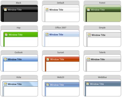
A Boolean value that controls the skin used in the window. In the example provided above, this is set to Web20.
•Black
•Default
•Forest
•Hay
•Office2007
•Outlook
•Simple
•Sunset
•Telerik
•Vista
•Web20
•WebBlue
A sample of each is shown here:

A Boolean value that controls whether or not the user can drag on the side of a column to resize it.
A Boolean value that controls whether or not the user can drag a column to a different location in the grid.
A Boolean value that specifies whether or not an option is available to the user to automatically resize the columns to fit the displayed data.
A Boolean value that controls whether or not the user can drag on the top or bottom of a row to resize it.
A Boolean value that, when set to true, will show a context menu with options to sort, group, and show or hide columns. When this property is set to false, the standard browser context menu is used.
A Boolean value that controls whether or not filtering options are included in the context menu.
A Boolean value that, when set to true, allows the user to drag on a column to resize it and show the results in WYSISYG mode.
The JavaScript function to call each time the page is refreshed.
A Boolean value, set to True in the example provided above.