 ) at the top of the page. A menu of
Views options will be displayed.
) at the top of the page. A menu of
Views options will be displayed.Calendar Displays offer the ability to create a view based upon the Advanced Data Providers for showing data stored in another site.
The process to create an Advanced view in a Calendar Display is not very different from creating a Standard view.
Within the main page of the Display Wizard, click on the
Create View icon ( ) at the top of the page. A menu of
Views options will be displayed.

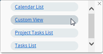
Within the menu, choose the Custom View link. The new
View will appear in the Visible Views section. Click on new View’s
Quick Edit icon ( ):
):

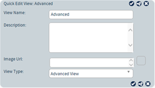
In the resulting Quick Edit View, rename the View and provide a description. Most importantly, in the View Type section select Advanced View.

Once the View has been named, click on the Edit View
icon  to be taken to the pages for editing the
View’s configuration.
To edit the settings for the Advanced View, click on the Edit
View icon  to be taken to the pages for editing the
View’s configuration.
Along the left-side of the Editing View page are three categories:
•Quick Configure: offers the ability to choose the data source and the columns available to the view.
•Refine Data: offers pages for maintaining sort, search, actions, and grouping options.
•Appearance: options for controlling how information is displayed within the component.
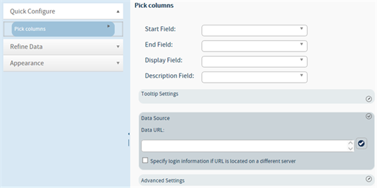
Within the Editing View page, choose the Quick Configure -> Pick Columns option.

1.
Expand the Data Source section by clicking on its editing icon ( ).
).
2. In the Data URL field, type the URL of the site where the Advanced XML data you want to work with is located.
Note: The Data URL field supports the use of Global Variables and the [SiteURL] function. The function formatting is important: [SiteURL] is supported while %SiteURL% is not.
3. Click
on the field’s check icon ( ) to validate the URL.
4. If the URL is located on a different server, place a mark in the Specify login information if URL is located on a different server checkbox. Provide the appropriate information at the prompts for User, Password, and Domain.
5. Click
on the section’s Save icon ( ) to close the section.
6.
Expand the Advanced Settings section by clicking on its editing icon
( ).
).
7. Use the Pass Through XML area to pass page parameters onto the page specified in the URL property. The < and > symbols must be encoded (e.g., < < and > >). The following variables are supported:
•<%CurrentPageFolder%> - The current folder URL where the web part resides (e.g., http://www.company.com/sites/site1/connections)
•<%HostName%> - The host name of the site where the web part resides (e.g., www.company.com)
•<%SiteSecurityType%> - The protocol type of the site where the web part resides (e.g., http://)
•<%SiteURL%> - The absolute path to the site where the web part resides (e.g., http://www.company.com/sites/site1)
Example:
<PassThrough>
<Pass>
<PTType>get</PTType>
<PTRequest>SearchString</PTRequest>
<PTName>SearchString</PTName>
<PTDefault>[Me]</PTDefault>
</Pass>
</PassThrough>
Where:
•PTDefault (Optional) – String – The default text that will be sent to the page from which data is being requested, if the parameter is not passed into the page.
•PTName (Required) – String – The name of the parameter that is to be passed onto the page from which data is being requested.
•PTRequest (Required) – String – The name of the parameter that is being received by the page.
•PTType (Required) – String – Controls the type of pass through. Use "post" to store the parameters in the header of the request or use "get" to store them in the URL.
8. The Add Column XML area can be used to add a column to the data collected from the external XML source(s). This is useful if you want to set a default value for a column if the initial column is null, like a currency field.
<AddColumn>
<Column>
<ColumnName>ZeroOfGroup1</ColumnName>
<ColumnType>System.Int32</ColumnType>
<Expression>IsNull(1*[Group Value0],
0)</Expression>
</Column>
</AddColumn>
Where:
9. Click
on the section’s Save icon ( ) to close the section.
10. Return to top of page.
11. Select the columns to be used within the Calendar. The columns displayed are those identified from within the Model List and Schema section.
•Start Field: The column to reference to determine the first date on which each item is to be displayed. The columns in this drop-down are limited to Date and Time type columns.
•End Field: The column to reference to determine the last date on which each item is to be displayed. The columns in this drop-down are limited to Date and Time type columns.
•Display Field: The column that contains the text that will be displayed on the calendar for the item. The columns in this drop-down are limited to text columns; decimals, date values, and other column types cannot be selected here.
•Description Field: The column that contains the text that will be displayed when describing the event.
12. Expand the
Tooltip Settings section by click on its Quick Edit icon ( ). This section controls how information
for a Calendar item is displayed when the mouse pointer hovers over the
item.
13. Once expanded, the following options are available:
a. Show text on item hover: Enabled by default. If disabled, no pop-up display is shown upon mouse pointer hover.
b.
Format: Advanced is enabled by default. This section allows for the
setting of the type of tooltip to display, plus what columns to
include.
The Basic and Classic options are similar.
With both, drag and drop the columns from Available section to the
Selected section. The information in the columns will be
displayed in the order presented, with style dependent upon the format
selected.
The Advanced option offers the best flexibility
as it supports basic HTML formatting. The Header and Body
fields can have columns added by using their Insert Field menus.
Additional text and script can be added into the fields. For example, the
following would display the creation date and the person who created the
selected item, with a series of hyphens between:
%Created%
-------------
%Created By%
14. To
collapse the Tooltip Settings section, click on its Check icon ( )
)
15. Once the
changes have been made, click on the Apply icon ( ) at the top of the page in order to save
them.
16. To modify more items, select the appropriate listing along the left side of the page.
17. If all
changes are completed, click on the Apply changes and exit icon ( ) found at the top of the page. The
component changes will be saved and you will be returned to the original web
part page.
18. Click on
the Home icon ( ) found at the top of the page. The
browser will return to the original Display Wizard page.
Once the columns for display are selected, options such as sorting, searching, and grouping can be set. The options presented within the navigation panel on the left side of the page are the same as those found in the Standard View. Please see that section for details.
Once all changes are completed, click on the Apply changes
and exit icon ( ) found at the top of the page. The
component changes will be saved and you will be returned to the original web
part page.