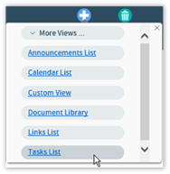
 ) at the top of the page. A menu of
Views options will be displayed.
) at the top of the page. A menu of
Views options will be displayed.For those CorasWorks customers who use the Advanced components in addition to the Basic, Grid Displays (and Calendar and Chart Displays) offer the ability to create a view based upon data that is stored in another site.
Within the main page of the Display Wizard, click on the
Create View icon ( ) at the top of the page. A menu of
Views options will be displayed.

Within the menu, choose the Custom View link. The new
View will appear in the Visible Views section. Click on new View’s
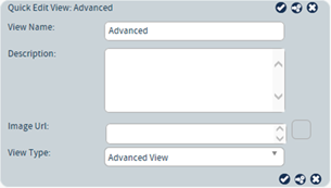
Quick Edit icon ( ):
):

In the resulting Quick Edit View, rename the View and provide a description. Most importantly, in the View Type section select Advanced View.

Once the View has been named, click on the Edit View
icon  to be taken to the pages for editing the
View’s configuration.
To edit the settings for the Advanced View, click on the Edit
View icon  to be taken to the pages for editing the
View’s configuration.
Along the left-side of the Editing View page are three categories:
•Quick Configure: offers the ability to choose the data source and the columns available to the view.
•Refine Data: offers pages for maintaining sort, search, actions, and grouping options.
•Appearance: options for controlling how information is displayed within the component.
Within the Editing View page, choose the Quick Configure -> Columns option.

1.
Expand the Data Source section by clicking on its editing icon
( ).
).
2. In the Data URL field, type the URL of the site where the Advanced XML data you want to work with is located.
Note: The Data URL field supports the use of Global Variables and the [SiteURL] function. The function formatting is important: [SiteURL] is supported while %SiteURL% is not.
3. If the URL is located on a different server, place a mark in the Specify login information if URL is located on a different server checkbox. Provide the appropriate information at the prompts for User, Password, and Domain.
4.
Click on the section’s Save icon ( ) to close the section.
5.
Expand the Column Settings section by clicking on its editing icon
( ).
).
6. Edit the settings to control the amount of space used by each column.
7.
Click on the section’s Save icon ( ) to close the section.
8.
Expand the Advanced Settings section by clicking on its editing
icon ( ).
).
9. Use the Pass Through XML area to pass page parameters onto the page specified in the URL property. The < and > symbols must be encoded (e.g., < < and > >). The following variables are supported:
•<%CurrentPageFolder%> - The current folder URL where the web part resides (e.g., http://www.company.com/sites/site1/connections)
•<%HostName%> - The host name of the site where the web part resides (e.g., www.company.com)
•<%SiteSecurityType%> - The protocol type of the site where the web part resides (e.g., http://)
•<%SiteURL%> - The absolute path to the site where the web part resides (e.g., http://www.company.com/sites/site1)
Example:
<PassThrough>
<Pass>
<PTType>get</PTType>
<PTRequest>SearchString</PTRequest>
<PTName>SearchString</PTName>
<PTDefault>[Me]</PTDefault>
</Pass>
</PassThrough>
Where:
•PTDefault (Optional) – String – The default text that will be sent to the page from which data is being requested, if the parameter is not passed into the page.
•PTName (Required) – String – The name of the parameter that is to be passed onto the page from which data is being requested.
•PTRequest (Required) – String – The name of the parameter that is being received by the page.
•PTType (Required) – String – Controls the type of pass through. Use "post" to store the parameters in the header of the request or use "get" to store them in the URL.
10. The Add Column XML area can be used to add a column to the data collected from the external XML source(s). This is useful if you want to set a default value for a column if the initial column is null, like a currency field.
<AddColumn>
<Column>
<ColumnName>ZeroOfGroup1</ColumnName>
<ColumnType>System.Int32</ColumnType>
<Expression>IsNull(1*[Group Value0],
0)</Expression>
</Column>
</AddColumn>
Where:
•ColumnName (Required) – String – The name of the column you want to add.
•ColumnType (Optional) – String – The type of column you want to add.
•Expression (Optional) – String – The expression used to store data within the column.
11. Click on the
section’s Save icon ( ) to close the section.
12. As a result of these steps, columns should be displayed within the Available Columns section. If they are not, there is likely a problem in the XML being returned or the formatting in the earlier steps.
13. To include a column in the component, drag it from the Available Columns section and drop it into the Visible Columns or the Hidden Columns section.
14. Once a column is in
the Visible Columns or the Hidden Columns section, click on its
Editing Icon ( ) to modify the information displayed within
the column.
15. Click on the column’s
Save icon ( ) to collapse and hide its options.
16. Once the changes have
been made, click on the Apply icon ( ) at the top of the page in order to save
them.
17. To modify more items, select the appropriate listing along the left side of the page.
18. If all changes are
completed, click on the Apply changes and exit icon ( ) found at the top of the page. The
component changes will be saved and you will be returned to the original web
part page.
19. Click on the
Home icon ( ) found at the top of the page. The
browser will return to the original Display Wizard page.
Once the columns for display are selected, options such as sorting, searching, and grouping can be set. The options presented within the navigation panel on the left side of the page are the same as those found in the Standard View. Please see that section for details.
Once all changes are completed,
click on the Apply changes and exit icon ( ) found at the top of the page. The
component changes will be saved and you will be returned to the original web
part page.