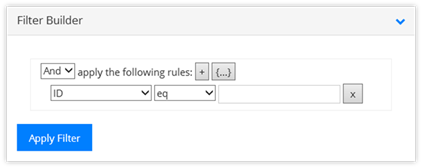
To start, choose the column being filtered upon, its operator, and the value. The operands are:
When building a Report, there are a lot of options provided in the Design Report/Edit Report panel. Some of the more popular options are detailed below.
•Site URL: This is the URL for the current site.
•Data Source: These are the available lists and libraries located in the Site URL location.
•Filter: The Filter Builder allows for the building of a simple filtering
structure. The results are stored as CAML within the Filter field.
To start, choose the column
being filtered upon, its operator, and the value. The operands are:
o  eq: equal
to;
o neq: not equal to;
o lt: less than;
o lte: less than or equal to;
o gt: greater than;
o gt: greater than or equal to;
o startswith: the value begins with;
o contains: the value contains this;
o isNull: field does not have a value (not the same as “not equal to”);
o isNotNull: the field contains a value.
•The filter supports more than one section. Click on the + to add another filter item in the same clause, the {…} to add another filtering clause entirely, and the X to remove a filter or a clause (red X).
•Click on the Apply Filter button to add it into the Filter field.
•Field: This is the column from the list or library being charted on within the report.
•Analysis: Its options are based on the type of column selected in the Field field. The options are Count, Sum, and Average. With most column types, Count will be the only option available.
•Enable 3d: By default, the charts are displayed in 2d. Enable this option to see them in 3d.
•Plot type: Determines how the chart should be displayed. Options change the Series types available.
o Vertical: Column charts, line charts, spline charts, area charts.
o Horizontal: Bar charts, line charts, spline charts, area charts.
o Pie: No Series Types.
o Doughnut: No Series Types.
o Funnel: Funnel modes are Square or Circular, plus the funnel can be inverted.
o Radar: No Series Types.
•Chart Height and Chart Width: The options are the same in both fields. They are: XSmall, Small, Medium, Large, XLarge.
These options change based on the Chart type. Popular options are:
•Chart Title: Enabled by default, allows for the inclusion of the title of the chart within the chart itself.
•X Axis and Y Axis Titles: Disabled by default; enable to provide axis titles.
•Tooltips: Enabled by default, this option allows for the display of information by hovering the mouse. The Tooltip Format options are selectable via the drop-down.
•Legend: Enabled by default, this section controls the location and alignment of the legend within the chart.
The charts support some level of animation. Place a check into the areas that should be animated when the chart is built or clicked on. If selecting Label or Markers, be sure they are enabled within the Display Elements.
•Animation type: This controls how the chart and its elements are animated. The choices fall into the following categories:
o Show (default): Element is just shown.
o Appear: Elements fade in without any motion.
o SlideFrom: With these choices the elements of the chart move into its place from the starting spot identified by the Animation type.
o ScaleX: Elements of the chart grows into position from the center, left, or right.
o ScaleY: Elements of the chart grows into position from the center, top, or bottom.
o ScaleXY: Elements of the chart grow into position from location identified in the Animation type.
o Outside: Limited to Pie and Doughnut charts only, Elements move into their place from outside of the chart.
•Motion type: This field supplies the type of acceleration/deceleration the animation should use when the elements of the chart move into place. The default value is Elastic (motion is defined by an exponentially decaying sine wave) while Linear and Back are also popular. Test to see what works best with the chart and animation types.
•The Duration field sets the animation duration in seconds, while the Start Time field controls the delay until the chart begins to move its elements into place.
•The Motion Type indicates if the elements should be moved into place at the same time (Together – default value) or one at a time (One by One and Smoothed One by One [doesn’t wait for the previous element to complete moving]).
•Name: This is the name of the report and the chart. Typically, the name is automatically copied from the Chart Design section but the fields are not required to match.
•Description: The chart description is optional and is displayed above the chart on the Report Widget.
•Enable Drill Down: Enabled by default, this option allows for the display
of the underlying data for the chart. When a user clicks on an element,
the information for that element is displayed.
The format of the
drill-down information is supplied by the “All Items” view for the underlying
lists or library. The columns included in the “All Items” view are
included in the drill-down information and the details window (click on an item
in the display).