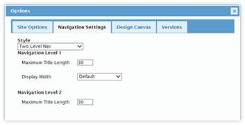

This section controls the navigation style for the CorasWorks Application Designer Solution.
The default style is Two-Level Navigation. In this style, the navigation is provided through tabs and buttons. The user clicks on a tab and the tab’s associated buttons are loaded. The user clicks on a button and the associated page, link, or form is loaded.
The second style is Two-Level Navigation Tabs Right. With this selection, the buttons stay on the left side of the display. The tabs, though, are shown on the right. This option is good for environments looking for a “file folder” approach.
The last style is Accordion Left. In this style the entire navigation is displayed along the left side of the page. The user clicks on a section, which expands and shows the options for that section. When the user clicks on the option, the associated page is loaded.
When the Accordion style is used, the section labels are the same as the Tabs in the Two-Level Navigation. The options within the sections are the same as the Buttons within the Two-Level Navigation. Finally, the icons selected for the buttons cannot be displayed within the Accordion navigation.
|
|
|
|
Two-Level
Navigation |
Accordion
Left |
When using the Two-Level Navigation, the display components (Grids, Calendars, other web parts) are presented under the tabs and buttons. With the Accordion navigation, the display components are presented to the right of the navigation. The exception is the Design Canvas: due to its width, it may be displayed underneath.
The Level 1 options control the display of the first level of the navigation: tabs for the Two-Level Navigation and section headings for the Accordion.
•Maximum Title Length: This field controls the maximum number of characters for a tab or section heading. It is applied when new tabs are created or existing tabs are edited, preventing the entering of titles beyond the maximum length. Current tabs are not affected. The default value is 20 characters.
•Display Width: This field controls the amount of space provided to the tabs when displayed on the page. The options are: Default, Min, Max, and Fixed.
o Default displays the tabs as wide as the title requires;
o The width with the Min selection is controlled by the value in the Min Display Field;
o The Max option sets all of the tabs equally, as determined by the width of the widest tab.
o The Fixed option is controlled by the Fixed Display Width field.
The Level 2 option controls the display of the second level of navigation: buttons for the Two-Level Navigation and section options for the Accordion. There is one option: Maximum Title Length. This field controls the maximum number of characters for the button or option. It is applied when new buttons are created or existing tabs are edited, preventing the entering of titles beyond the maximum length. Current buttons are not affected.