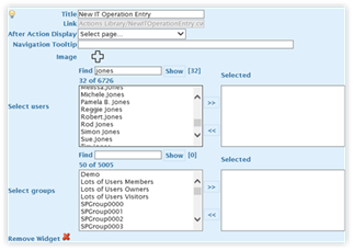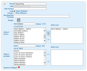
Edit panel for Forms
Widgets-Based
Buttons (v4.0.11

Edit panel for Pages, Links,
Reports and
Dashboard Widgets-Based Buttons
(v4.0.11)
To change the button’s image, title, and other options, hover over the button and click on its edit button. An editing panel will be displayed. Generally, the editing options are the same regardless of the Widget type. The exception is with the Actions Widgets.
The required fields are the Title, Link, and Image. All other fields are optional.
|
|
|
The options within the edit button panels are:
•Title This field contains the name that is displayed for the button within the Navigation. Click in the field to edit the title.
•Link This field cannot be edited. It displays the URL or Actions file name that will be used when the user clicks on the link. To change the link, edit the original Widget.
•Link Parms This optional field contains parameters being passed at the end of the URL. Note: The question mark is automatically applied to the parameter string (i.e. – page1.aspx?<<parameters>>).
•Link Target There are two options for this field, controlling where the link is opened into.
o Same Window: Opens the link or page in the current browser window. This is the default selection.
o New Window: Opens the link in a new window.
•Navigation Tooltip This field holds the tooltip for the button. Enter a message to be displayed when the user hovers over the button.
•Image The displayed icon is the image that is displayed for the
button. To change the image, click on the icon. A panel will load,
showing a selection of icons. Click on an icon to select one for the
button.
Note: When using the Accordion navigation, button icons
are not displayed.
•Select Users This field has a listing of users who can see the
button and access the page, link, or Action. By default, all users can
view the button. Click on this field to limit the users who can access the
button.
To select the users who can see and click on this
Navigation Level 2 item, look at the Select Users listing. The users on
this list are provided by the Site Collection/Web Application, consisting of
users who have been given explicit permissions. It also includes user who
have visited the Site Collection/Web Application. Members of an Active
Directory group granted permission in the Site Collection/Web Application will
not be included unless they have visited the Site Collection/Web Application or
were granted specific permission.
Click on a person to provide
them permission to see the button. More than one person can be granted
permission and the list does not display SharePoint groups. Users can also
be removed from specific users by removing them from the list. The users
are saved when the Publish button is pressed.
|
NOTE |
The listing of available users is restricted to the first 50 users in alphabetical order. When there are more than 50 users, enter part of the user’s name into the “Find” field and click on Show. This will reveal a list of matching users who can then be selected. The initial listing is for 50 users and cannot be expanded to show more. |
•Select Groups This field has a listing of SharePoint Groups that
can see the button and access the page, link, or Action. It works in a
similar manner as the “Select Users” field. Click on the SharePoint
Group(s) whose members who can access the button.
|
NOTE |
The listing of available SharePoint groups is restricted to the first 50, in alphabetical order. When there are more than 50 SharePoint groups, enter part of the group’s name into the “Find” field and click on Show. This will reveal a list of matching groups that can then be selected. The initial listing is for 50 groups and cannot be expanded to show more. |
•After Action Display When the Action from the Actions Widget is
done running, the user may need to be sent to a web page. This field,
unique to the Forms Widgets type, gives a selection of pages from the current
Navigation.
The drop-down is populated by the Navigation Level 2
Buttons, specifically the Pages Widgets type. If the page required was
recently created, be sure to publish the navigation and then reload the Design
Canvas page in order for the page to appear in the listing.
This
field is empty by default. As a result, when the Action is run, the Action
form appears and the user can enter the appropriate information. Once the
entry is completed and the item is saved, the user’s page does not change.
•Remove Widget Click on the red X to delete the button. This change cannot be undone and, once the Publish action button is clicked, is permanent.
When the Button’s settings are completed, click on the exit
button  to close the Button editing panel.
There is one additional button within the panel. On the left side of the panel is a light bulb. When it is “lit” (bright) it means the button is going to be displayed in the Navigation. When it is not lit (dark) it means the button is not going to be displayed. Lit is the default setting for the tab.
|
NOTE |
DO NOT hit the browser’s refresh button while editing within the Design Canvas. Changes to the Navigation are saved when the Publish button is clicked. If the Design Canvas page is refreshed, changes made since the last Publish will be lost. A “best practice” is to regularly click on the Publish Action button to save changes to the Navigation. If the browser page is accidentally refreshed, regularly publishing will prevent work from being lost. |