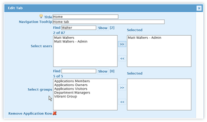
As mentioned earlier, the Widgets are key for building the Navigation. Once the Widgets are created, they are dragged and dropped into the Navigation section. Before this can happen, though, the first-level navigation structure (Tab or Section Headings) needs to be created.
1. In the Actions Buttons section, click on the “New Tab” icon. A tab will be created within the Navigation structure, entitled “New”.
2. Hover your mouse over
the newly created tab and the edit button will be
displayed.

3. Click on the Edit
icon. A series of fields will be displayed (detailed below). All but
the Tab/Section Name field is optional.

•The field in the top left corner is the title for the tab or section. Click in the field to edit the title.
•The next field holds the tooltip for the tab/section. Enter a message to be displayed when the user hovers over the tab or section heading.
•The “Selected” field has a listing of users who can see and click on the tab. By default, all users can access the tab. Click on this field and choose the users who can see the tab. The Tab/Section Heading will be hidden for all other users.
|
NOTE |
The listing of available users is restricted to the first 50 users in alphabetical order. When there are more than 50 users, enter part of the user’s name into the “Find” field and click on Show. This will reveal a list of matching users who can then be selected. The initial listing is for 50 users and cannot be expanded to show more. |
•The “Selected” field has a listing of SharePoint groups who can see and
click on the tab. Click on this field and choose the SharePoint Groups(s)
whose members have permission to see the tab.
|
NOTE |
The listing of available SharePoint groups is restricted to the first 50, in alphabetical order. When there are more than 50 SharePoint groups, enter part of the group’s name into the “Find” field and click on Show. This will reveal a list of matching groups that can then be selected. The initial listing is for 50 groups and cannot be expanded to show more. |
4. Once the changes are made, click on the green check mark a to save the changes.
There are two additional icons in the edit tab section. The icon beside the green checkmark is a light bulb. When it is “lit” (bright) it means the tab is going to be displayed in the Navigation. When it is not lit (dark) it means the tab is not going to be displayed. Lit is the default setting for the tab.
The last icon is a red X. Click on the red X to delete the tab as well as its buttons. This change cannot be undone and, once the Publish action button is clicked, is permanent.